
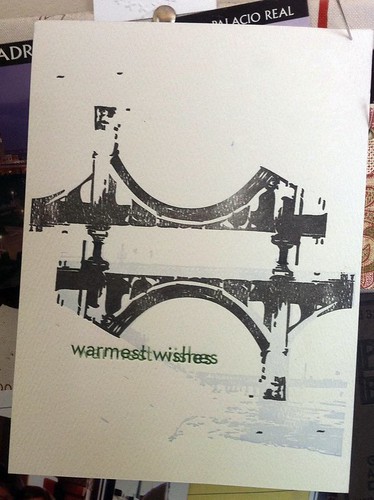
When I look back at test prints I marvel at its raw beauty, mistakes and all. They often find their way on my bulletin board because in a way, one-of-a-kind art has been created.
This print takes me back to when I was printing these two-colored cards of a bridge over the L.A. River. In the process, I felt that the black was too harsh for the soft lilac color in the background. The press was scrubbed clean of the black ink and purple ink was applied instead.
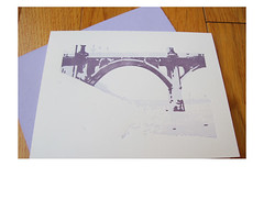
The cards turned out better than if I had printed them in black but this test print brings out some other kind of beauty.
No comments:
Post a Comment